Useful medical diagrams for patients
Diagrams for the medical industry are often described from the perspective of an organisation or hospital, but how can the most important people in medicine - the patients - use diagrams themselves to get better treatment outcomes?
Doctors are under pressure to see as many patients as possible. Plus, it can be quite intimidating for patients during a consultation, and often impossible to describe all relevant symptoms in a way that is concise and clear.
Diagrams that present all the relevant information make life easier for both the patient and doctor.
Humans take in information faster and misunderstand less often when it is presented visually. Plus, if you diagram your medical problems, you can re-use the diagrams with other doctors - it saves you the stress of remembering all the details and explaining them in exactly the same way multiple times.
So, what type of diagrams can patients use?
Concept maps to relate symptoms
A directed graph or concept map can show at a glance which clusters of symptoms are related, and which are secondary. Such a diagram helps doctors evaluate which illnesses could be the underlying problem and find solutions for multiple symptoms.
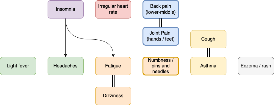
- Use light fill colours to group related clusters of symptoms, and black text for ease of scanning and printing.
- Use thicker connectors or shape outlines to show a stronger impact (Line in the Style tab of the format panel).
- Use arrows or a double connector for symptoms that are triggered by other symptoms.
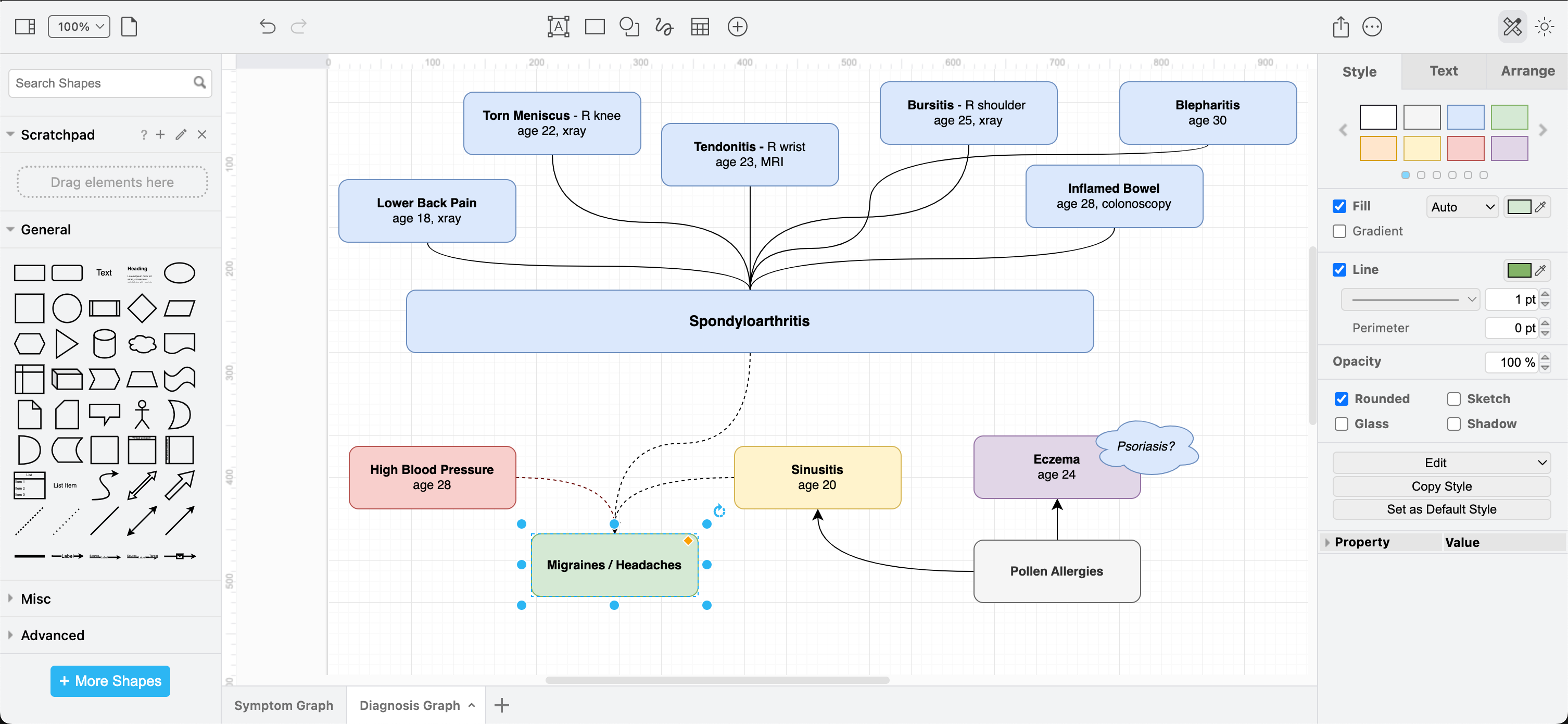
Concept maps to detail diagnoses
Doctors may find it more helpful to see how diagnoses are related if you are unlucky enough to have been diagnosed with several illnesses, especially where treatments can interfere with other diagnoses.
Timelines and symptom cycles
To show when symptoms started and how they have progressed, or how symptoms appear to worsen or get better in cycles, a timeline or a gantt chart is ideal.
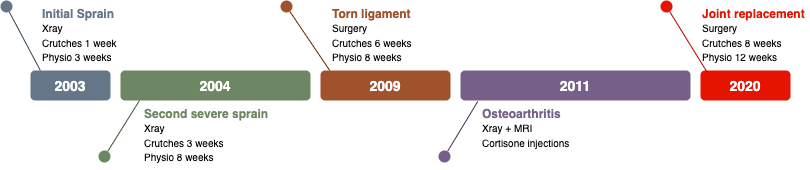
You could also use such a symptom timeline to show how a medication change has impacted symptoms - important when trialling which medication has the most positive effect.
If you have a recurrent problem that requires repeated surgeries or courses of hefty medication, a visual timeline avoids having to explain a lengthy treatment history in conversation, where things are likely to be forgotten or out of order. Use a gradient fill colour to show how symptoms worsen or improve during the cycle.
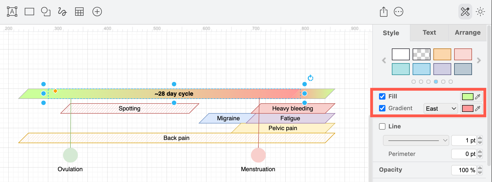
You will need a few cycles of tracking and recording your symptoms to discover a pattern, but doctors say they find this type of diagram helpful for both diagnosis and treatment.
Triggers vs symptoms
There are a number of ways to visualise symptoms that are not tied to a timeline or periodic cycle. You could use a cause and effect diagram like the one below, a concept map or mind map, a cluster graph, relational graph - anything that shows how your triggering situations or substances relate to symptoms.
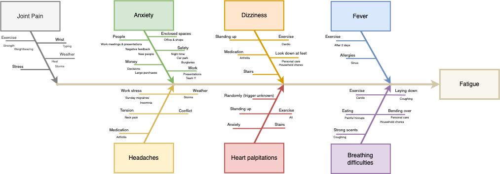
Take the time to record when symptoms appear and what caused them. This is increasingly important with the rise of long covid and other post viral problems, as well as for diagnosing arthritis and other autoimmune diseases, and non-specific chronic pain issues.
T-charts and Venn diagrams also let you quickly and visually sort a list of treatments, situations or medications into categories - those that improve or worsen symptoms, or have no impact.
More diagrams for patients
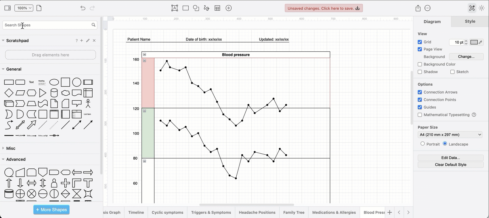
There are many other types of diagrams that may be useful, especially if you are attending a doctor’s consultation online.
A chart of blood pressure values, or weight over time. If you use a smart blood pressure monitor, export the graph from your monitoring app as an image and drag the image onto the drawing canvas in draw.io.
Or, track it yourself directly in draw.io using a Pool shape from the Advanced shape library and the Waypoint shape (via a shape search) for each value.
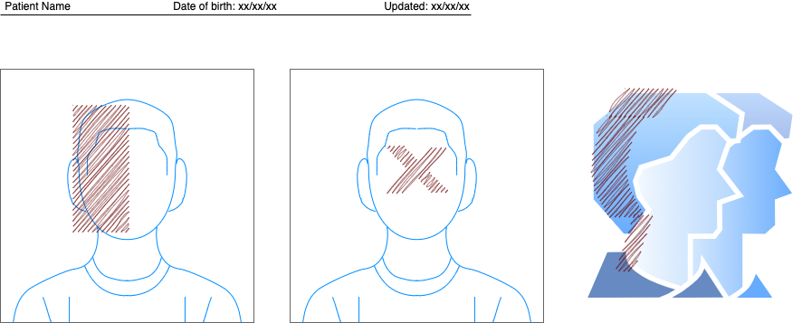
A labelled photograph or illustration showing exactly where the symptom occurs, or a freehand sketch. The example below uses shapes from the draw.io library (search for user) with basic shapes on top filled with the sketch style to indicate where different types of headache pain is located.
Organise and update your medical diagrams
Turnover of staff and short leaves of absence in medical clinics has increased in recent years. Which means, you will likely not see one doctor regularly. That makes it more important for you as the patient to be able to explain your medical history quickly to any new doctor - diagrams will help you do this.
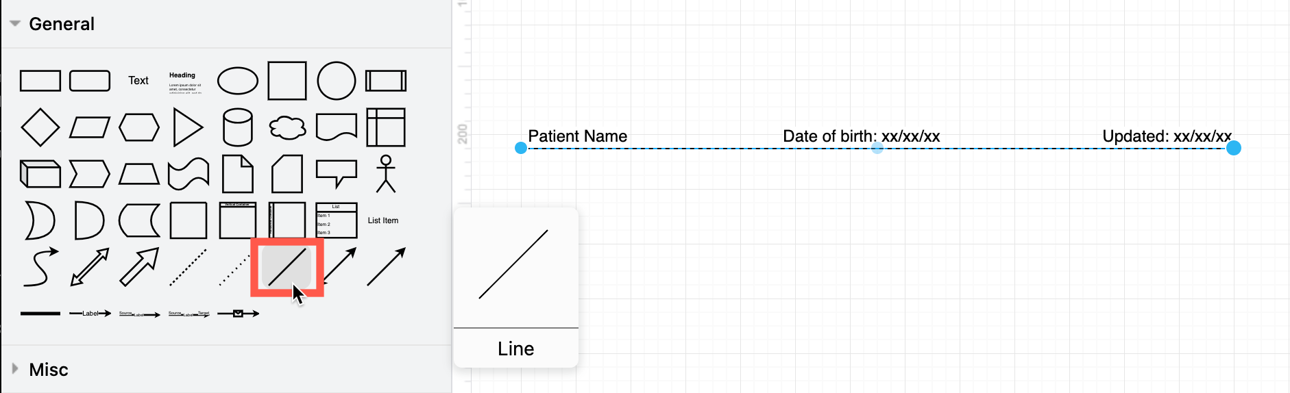
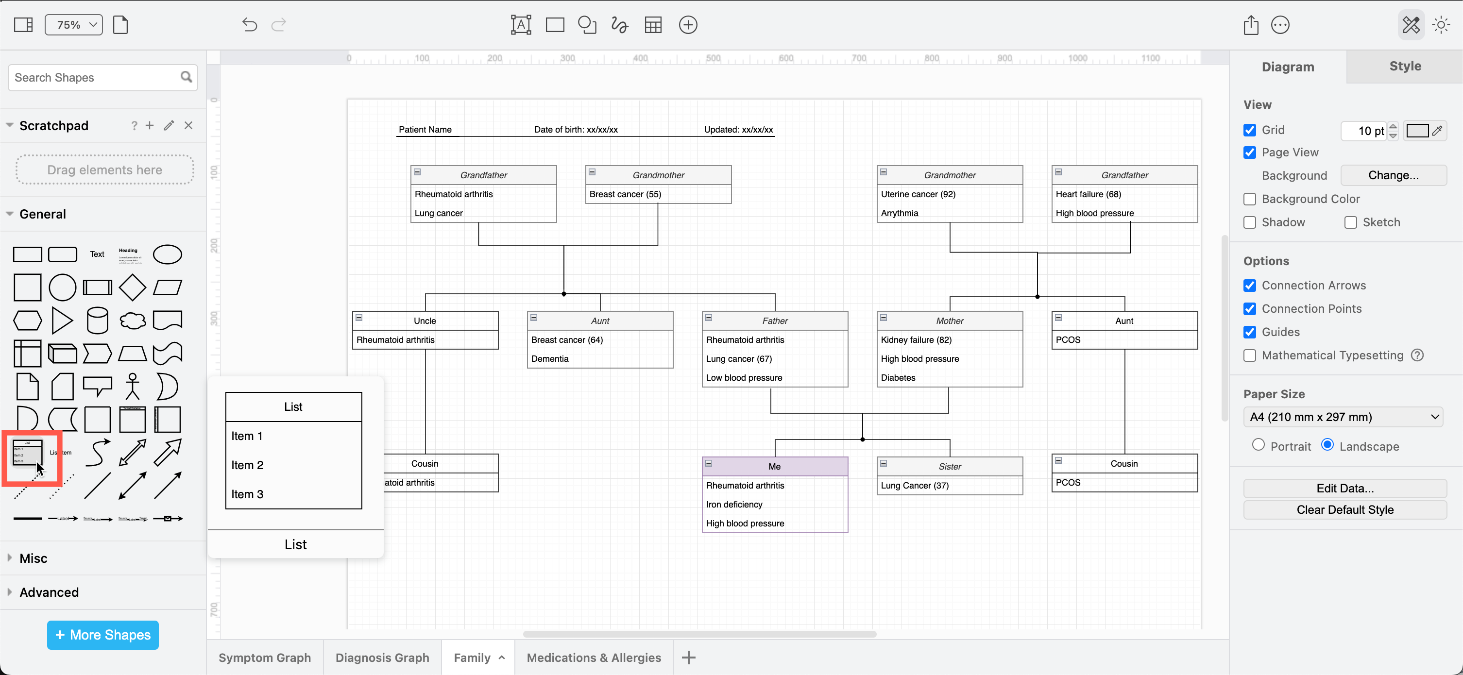
Include your name, date of birth and the date you updated the diagram on each page - this helps doctors associate a health record with a patient. Use a plain connector with three labels as it is easy to copy.
More diagramming tips for patients
-
Encourage your doctors to scan these diagrams, especially if they need to review your history without you present for insurance or welfare purposes.
-
Use one multi-page diagram for your medical diagram - you won’t have to hunt through files to find all the relevant information.
-
If you are dealing with inherited or genetic diseases, use the list shape in the General shape library to model a family tree of diagnosed related illnesses.
-
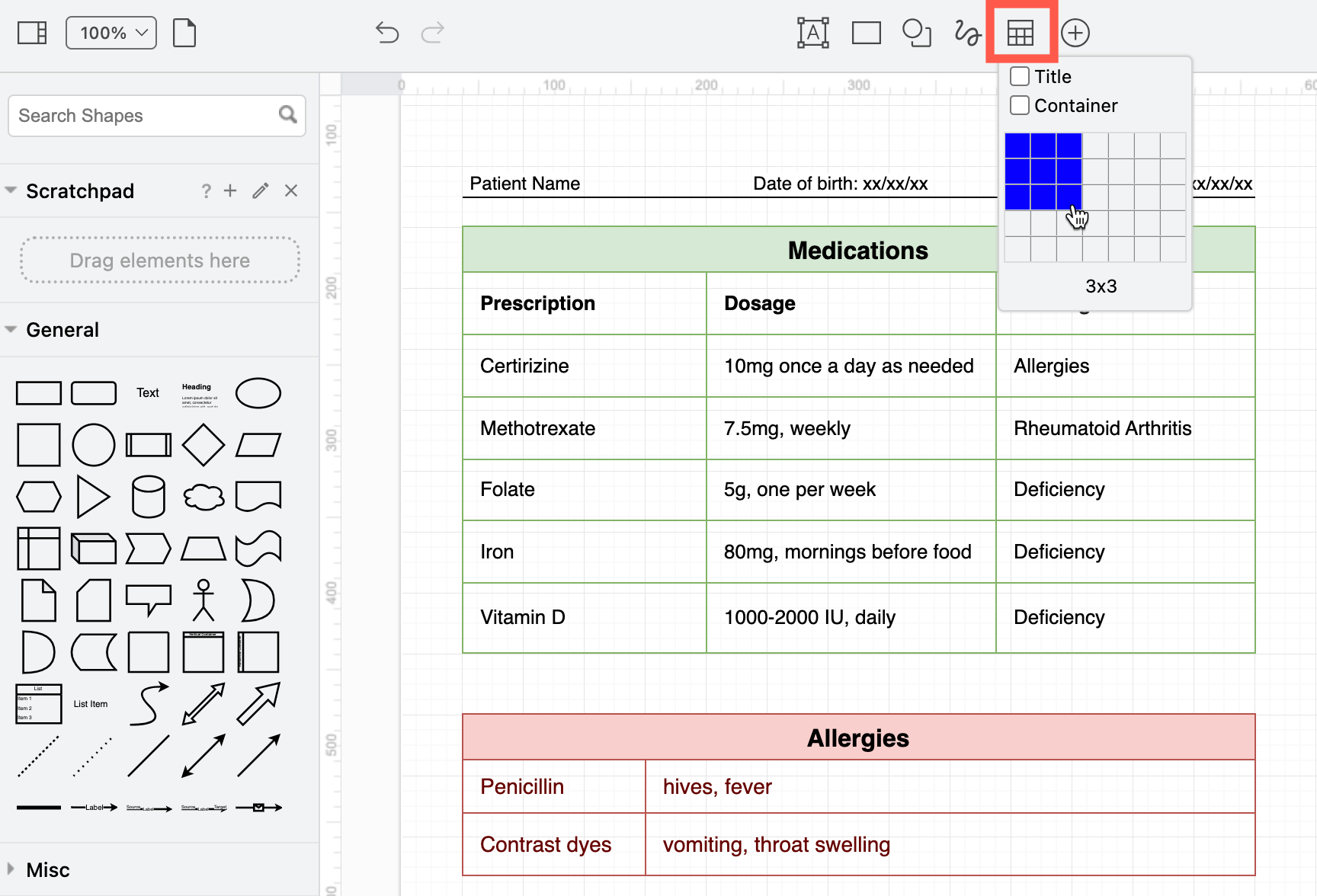
Use a table shape to record your medication schedule and allergies on one of the diagram pages.
-
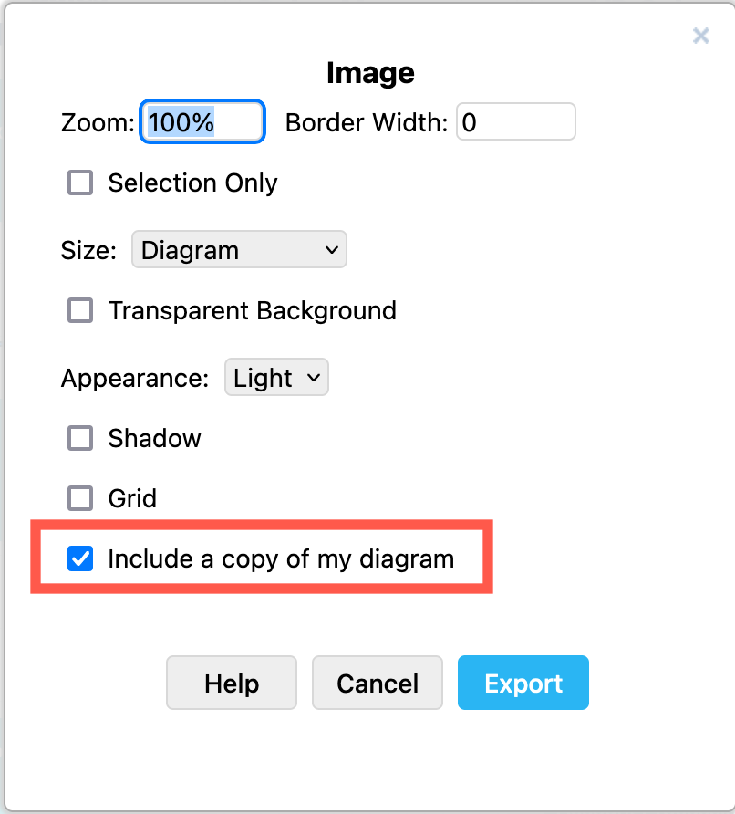
Export each page of your diagram to an image (PNG) to print it neatly on one neat page and include the diagram data - this will include all diagram pages, although only one will be shown in the image. You can then reopen the PNG image in draw.io later to update your multi-page diagram.