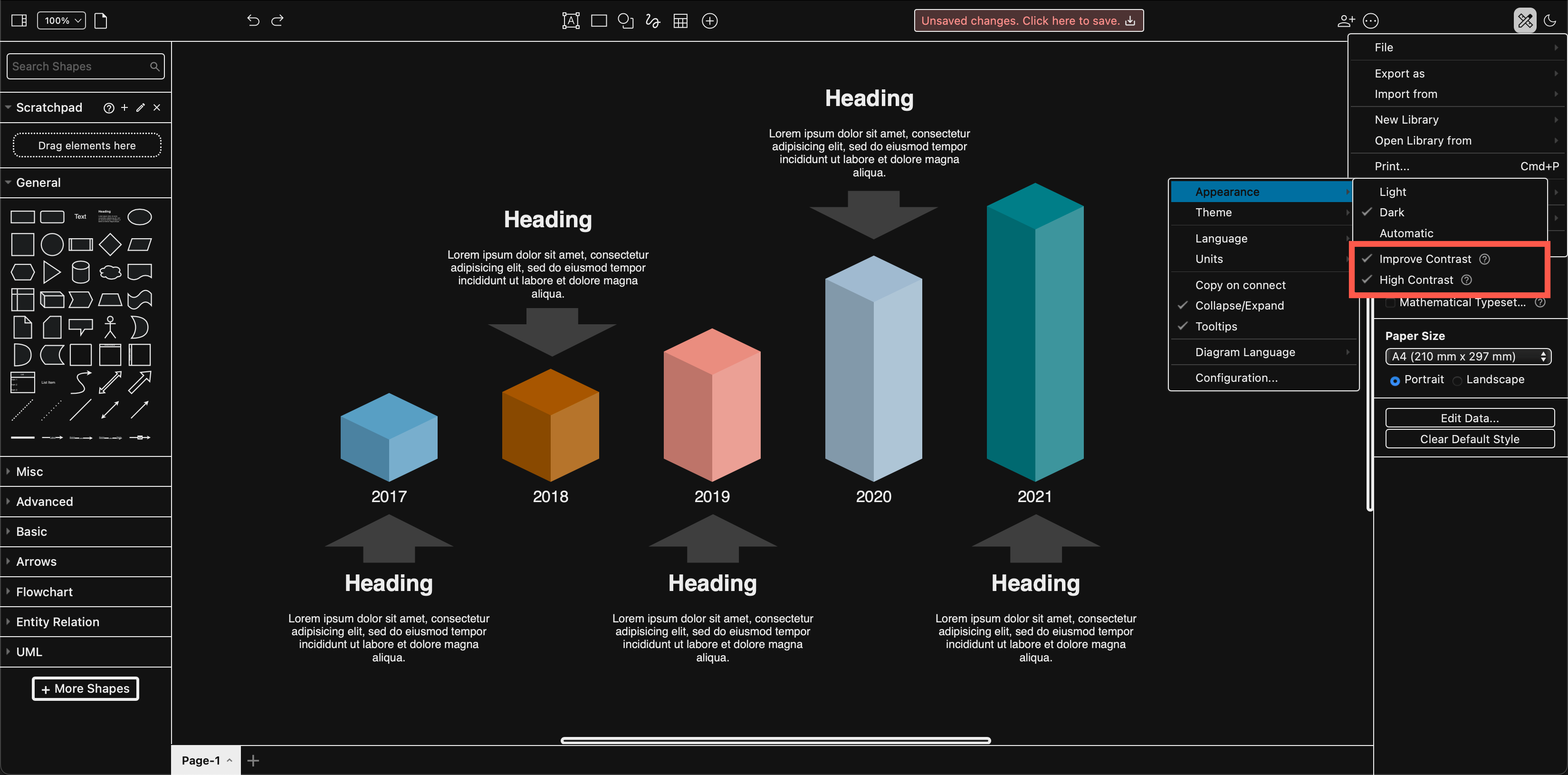
Improve contrast and high contrast modes in draw.io
There are two new high contrast modes available in draw.io: High Contrast makes the editor interface easier to read without adjusting your monitor’s contrast settings, similar to the accessibility options in your operating system, and Improve Contrast updates dark mode colours for better readability and provides a dark mode colour palette.
High contrast mode simplifies and removes non-essential backgrounds and increases the definition between interface elements by adding clear outlines.
You may find it is easier to read text and it can reduce eye strain. While these modes were initially developed for users with low vision, light sensitivity, or poor contrast vision, they are becoming more popular.
High Contrast mode
Choose Settings > Appearance > High Contrast from the draw.io menu.
When you enable high contrast modes or themes in your operating system, the range of colours in the interface is reduced and visual elements are simplified. Panels, tools, buttons, and toolbars have simpler backgrounds (white in light mode, black in dark mode), with a clear outline to better separate the various parts of the application’s interface.
In the draw.io editor, High Contrast mode works in the same way.
- Panel backgrounds are simplified to off-white (light mode) or nearly black (dark mode).
- Text labels, shapes, and tools that were previously grey are clearer - black (light mode) or white (dark mode).
- Strong contrasting outlines are added around buttons, between the shape libraries, around the format panel tabs and other elements in the editor interface: a crisp white outline in dark mode, and a black outline in light mode.
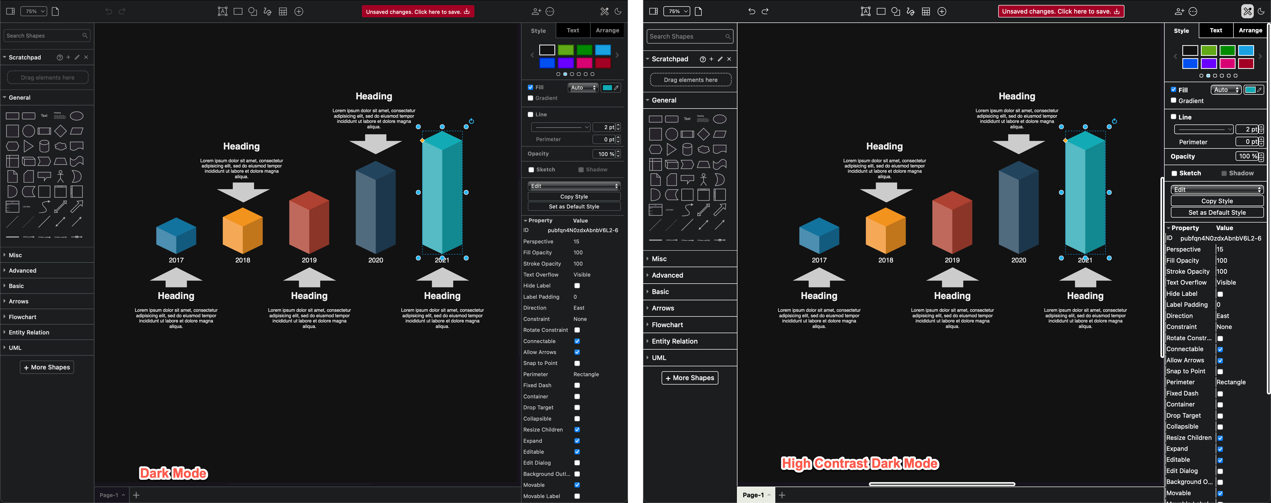
The default dark mode is on the left in the screenshot below, and High Contrast mode on the right.
High contrast mode works with all draw.io themes in both dark and light mode, including the Sketch online whiteboard theme.
Improve Contrast - better colours for dark mode
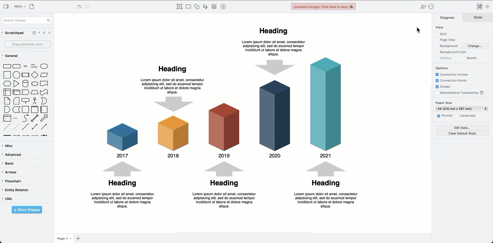
Dark mode is often used to reduce eye strain - with draw.io you can diagram in dark mode using any of our editor themes (click the sun/moon icon in the top right and select the mode you want to use. Alternatively, select _Settings > Appearance > Dark Mode from the menu).
When we updated how colours automatically change when working with draw.io in dark mode, many requested that the light mode palette remain the default. If you prefer, you can switch to the improved contrast dark mode colour palette - it may help you read text and labels more easily in your diagrams in dark mode.
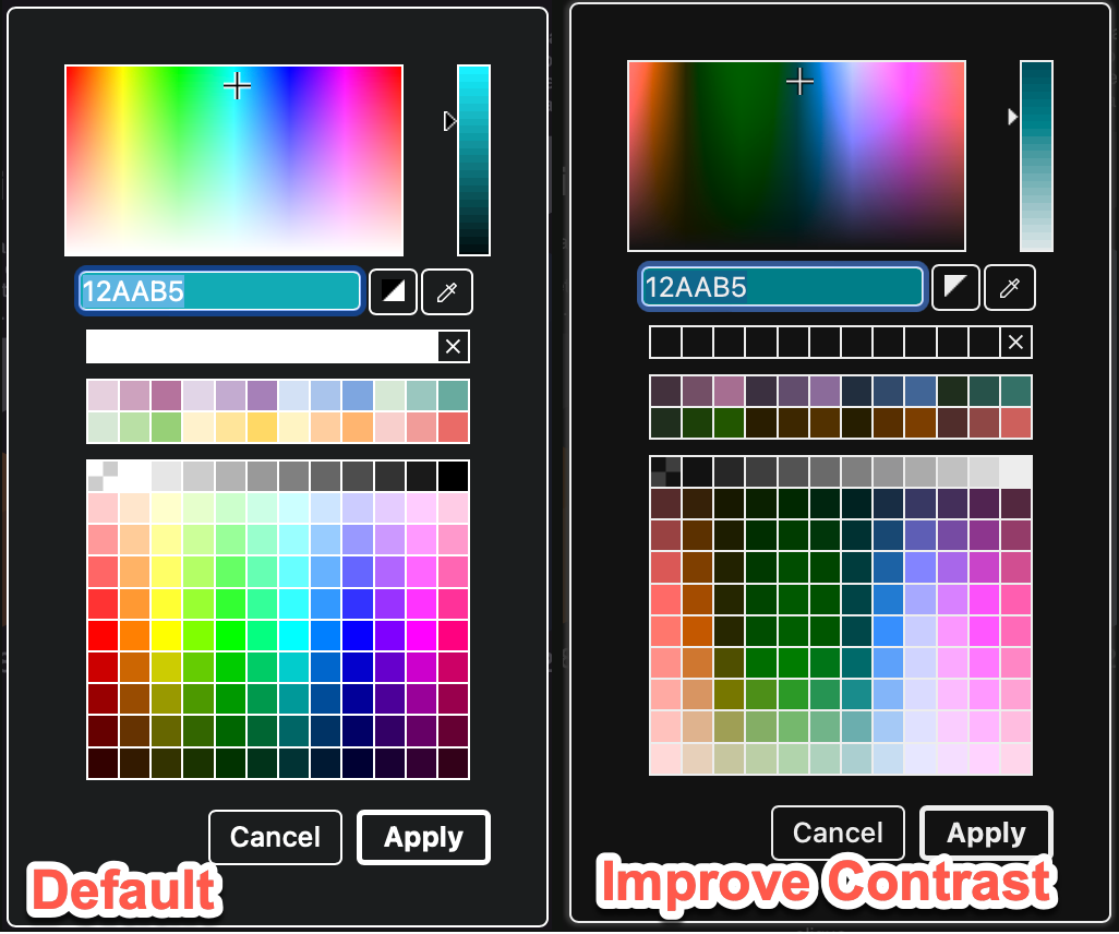
In dark mode, select Settings > Appearance > Improved Contrast from the draw.io menu.
Improved Contrast and High Contrast work well together. When both are enabled, the interface also uses the improved contrast colour palette, making it even easier to distinguish between different parts of the draw.io editor.
In the screenshot below, the left has both High Contrast and Improve Contrast enabled - the Style tab palettes, and shapes in the diagram on the drawing canvas use more muted colours, and you can more easily see the alternating backgrounds in the shape Properties section.
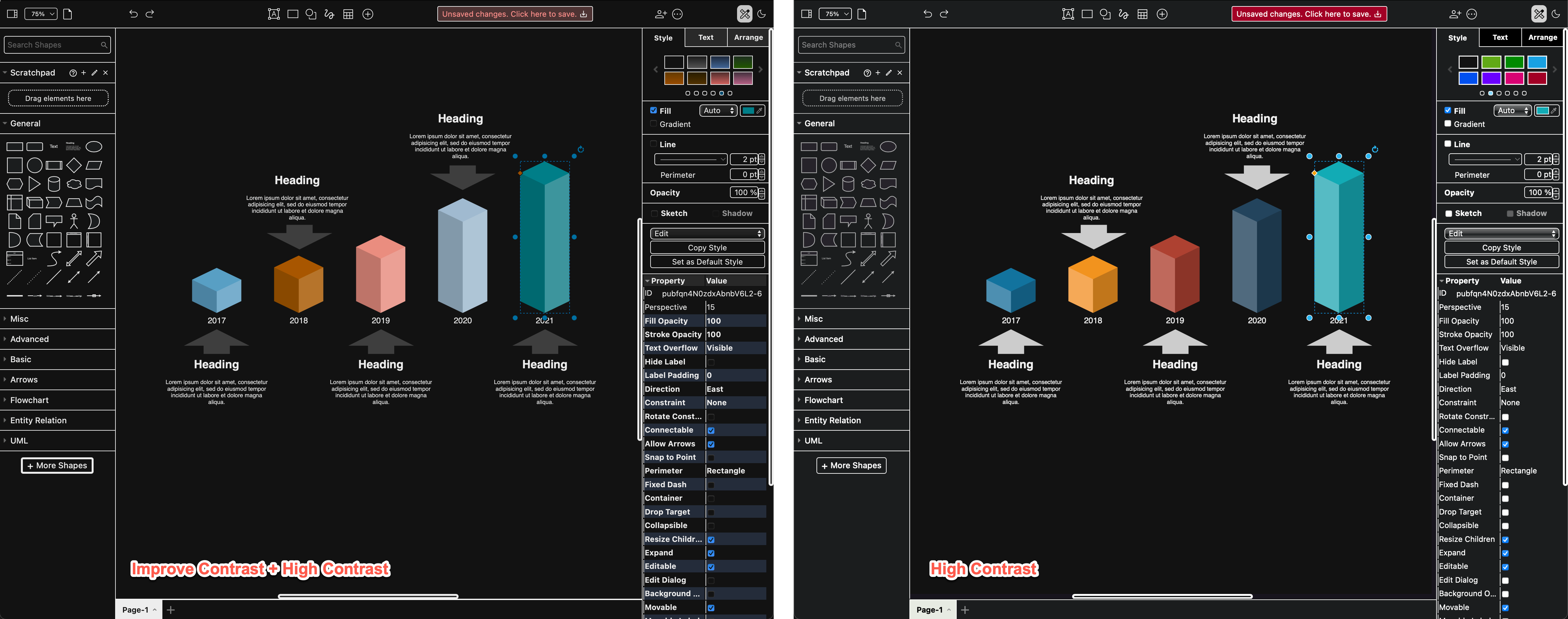
If High Contrast alone feels a little too stark and bright when you are diagramming in dark mode, enable Improve Contrast as well.
Note: Improved Contrast does not change the editor interface in light mode - this is only for dark mode.