Can you draw graphs and charts in draw.io?
draw.io is not a spreadsheet program - there are no figures from which to draw charts and graphs automatically. But there are plenty of useful shapes in draw.io, so you can easily create attractive charts and graphs for presentations and infographics.
Graphs and charts in non-research or non-financial reports and presentations usually convey the gist of some information in a visually impactful way, via trends or groupings, but without exact values.
Many people draw these painstakingly by hand using the rudimentary sketch tools in presentation software or word processing applications. With the right shapes, it can be so much faster and easier in draw.io.
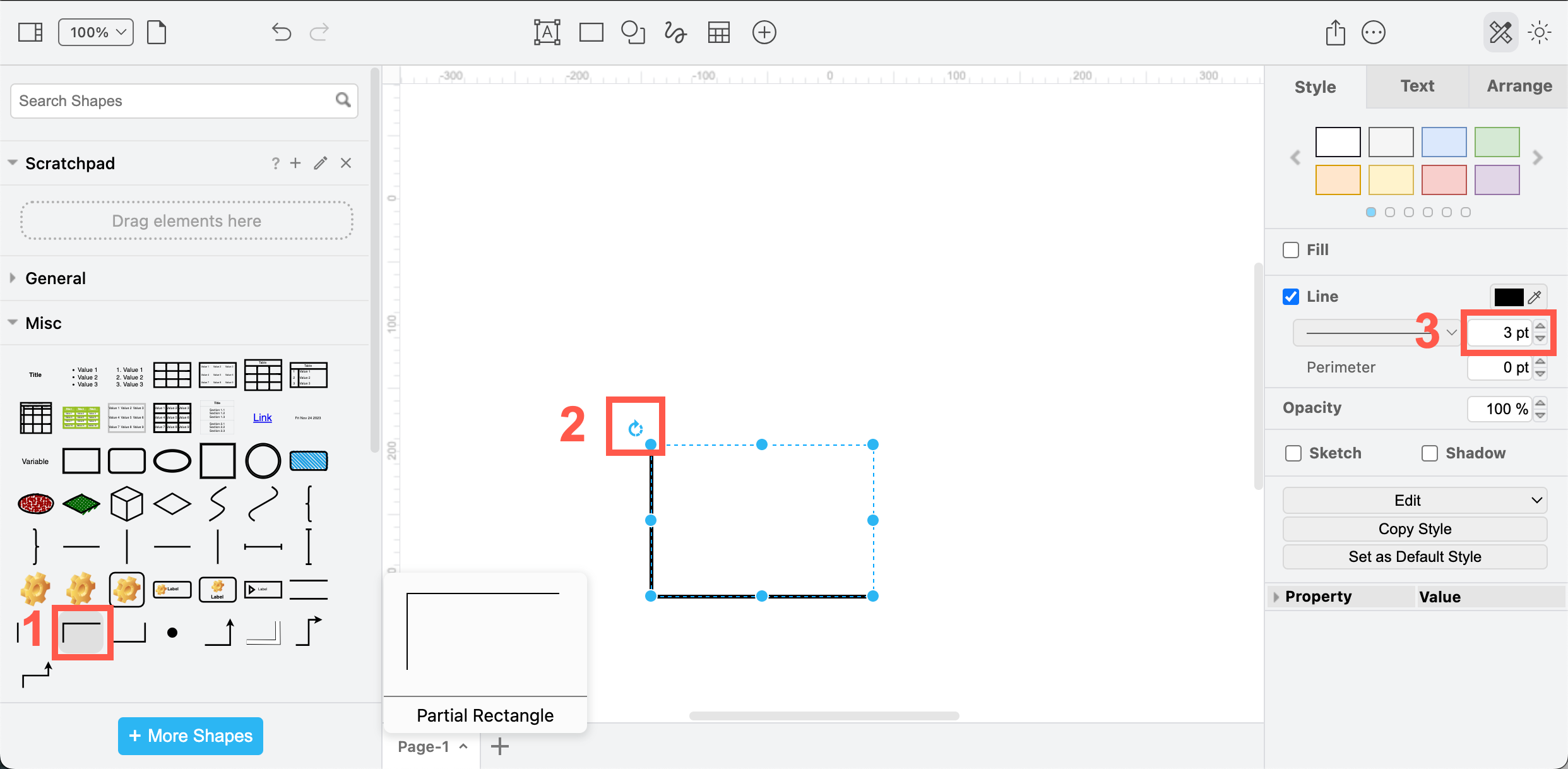
Draw an X Y axis
- Use the L-shaped Partial Rectangle shape from the Misc shape library (part of the General default shape library).
- Rotate it as needed.
- Make the axis thicker by change the line weight in the Style tab of the format panel.
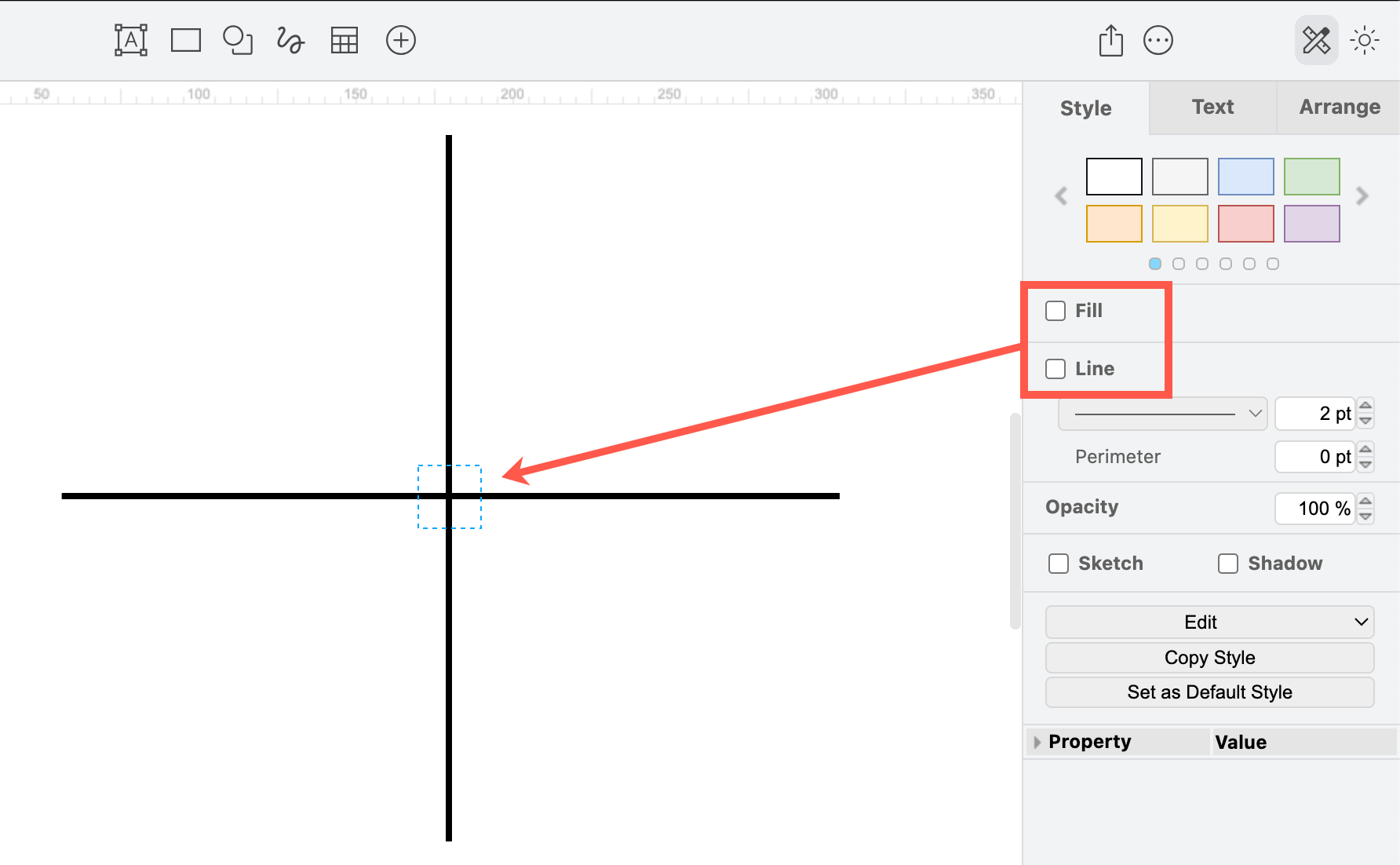
Alternatively, draw an axis with two connectors - use a waypoint shape to connect them at the point where they cross. You can make the waypoint shape invisible by deselecting Line and Fill colours in the Style tab of the format panel.
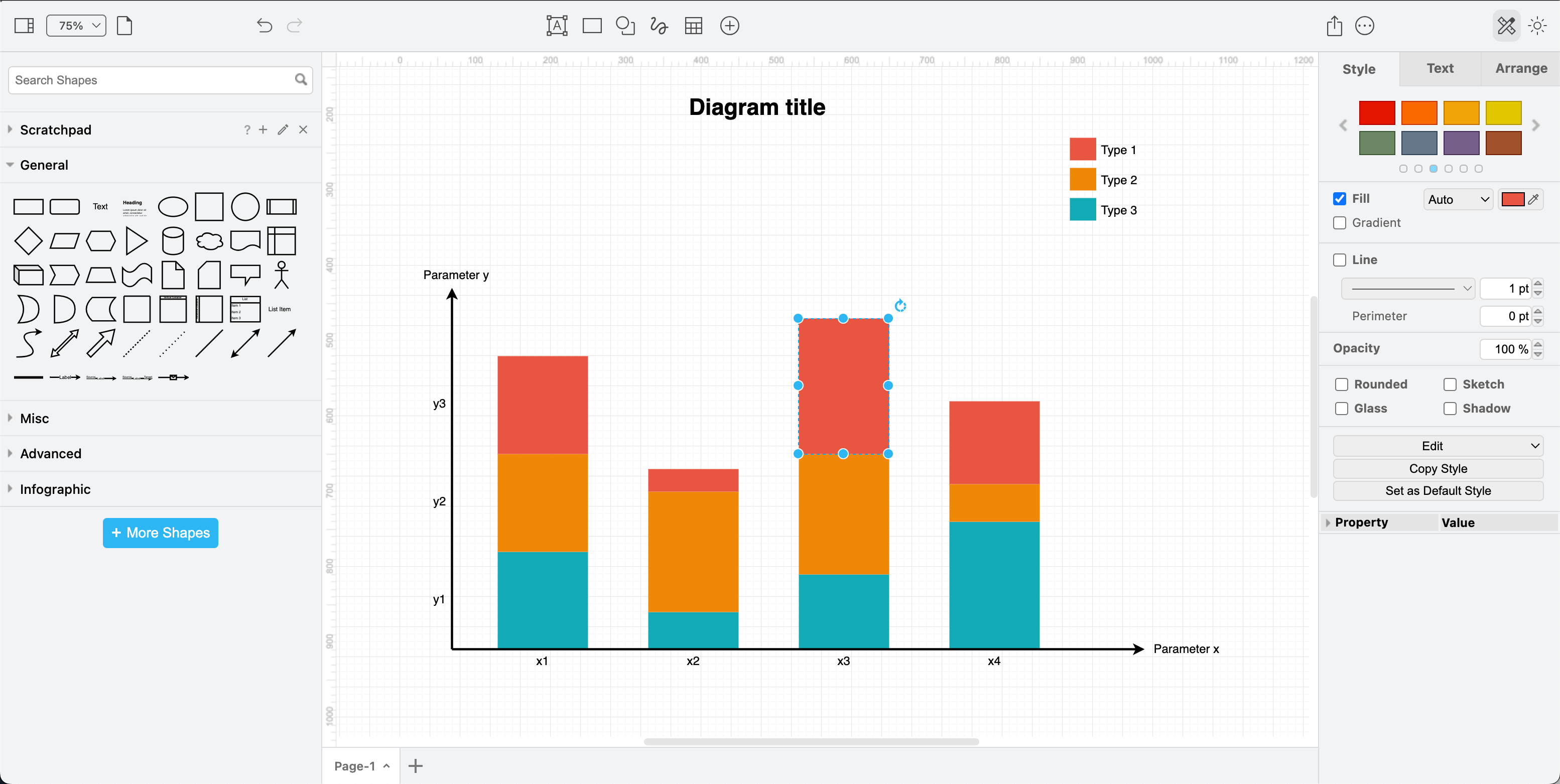
Bar charts
Bar charts are easy to draw - add an X Y axis, and then resize and style rectangles to make your bar graph, either horizontally or vertically. You can even draw a connector attached at fixed points to the top edges of the rectangle to show a clear trend line.
This bar chart template frm the Charts category in the template library can be easily modified, and contains a legend for the bar colours.
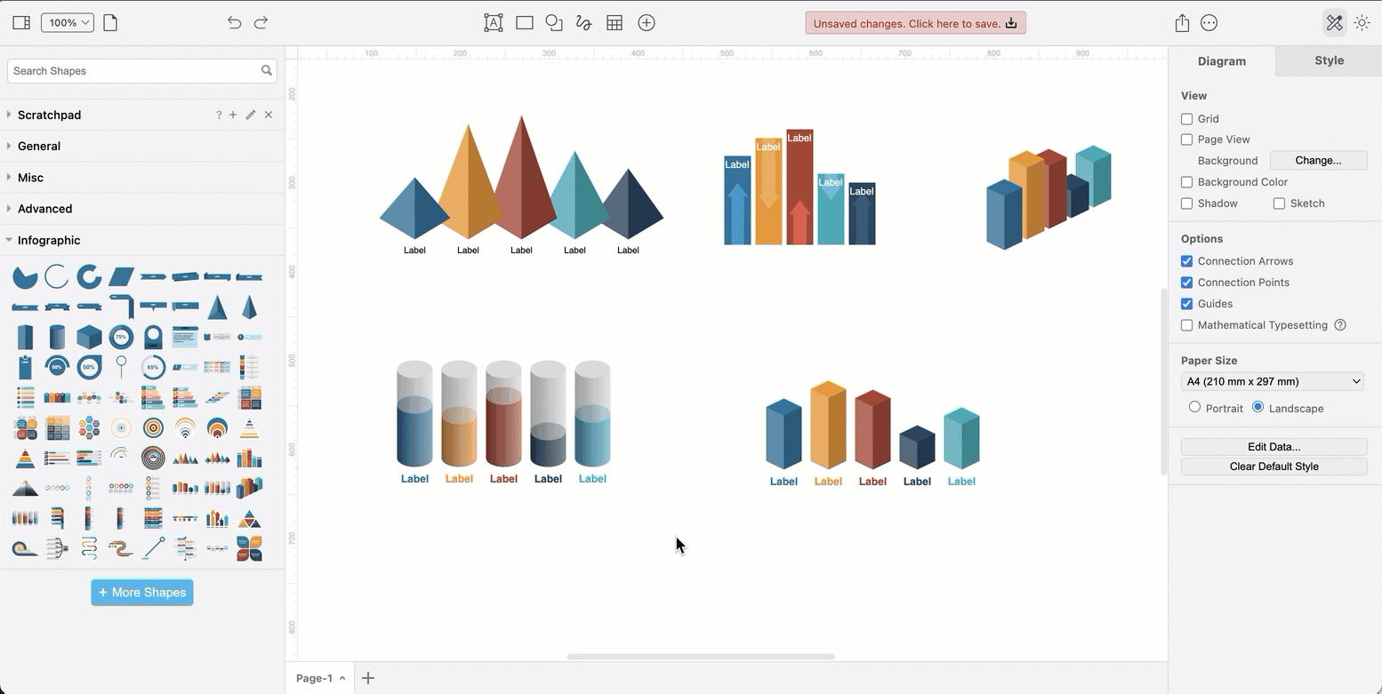
Alternatively, the infographic shape library has a number of bar graph shapes that you can use in presentations. These are made from many individual shapes - drag the top edges to change the height of the bars, copy and re-colour to add extra bars.
Tip: Use the helpful blue guidelines for positioning the graph’s bars so they are evenly spaced and all start at the same height.
You can layer any ‘stackable’ 3D shape to visualise a percentage.

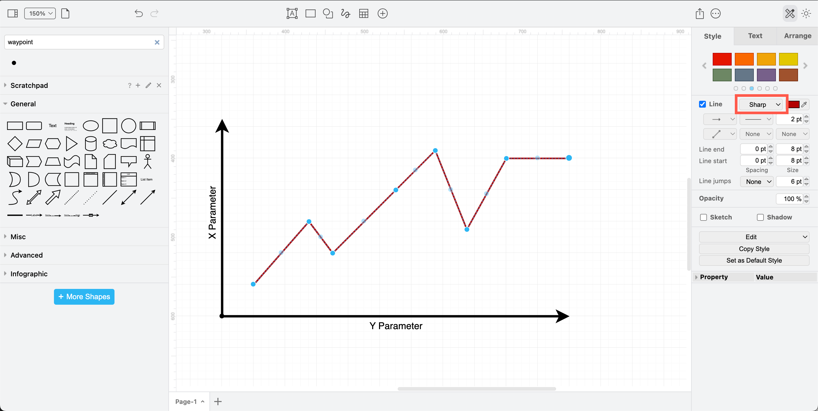
Line graphs
Draw a line graph with a single connector.
- Make sure you select Sharp for the line type in the Style tab of the format panel.
- Drag the light-blue dots in the middle of a connector section to add a new connector way point. Keep doing this to quickly form the shape of your line graph.
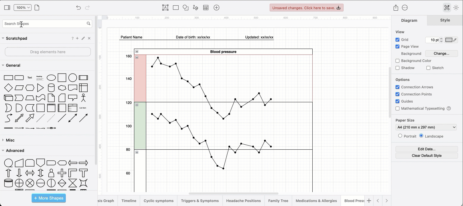
Use the waypoint shape and a swimlane pool
If you want to draw a a more accurate line graph, use the pool shape to show important values at the swimlane boundaries, drop the waypoint shapes on the drawing canvas at the right positions, then draw straight connectors between them. For example, this blood pressure chart.
Pie charts
Use infographic shapes
Click More Shapes at the bottom of the shape panel, scroll down and enable the Infographic shape library, then click Apply.
The infographic shape library contains Pie, Arc and Concentric Ellipse shapes which are ideal for pie graphs and other circular charts.
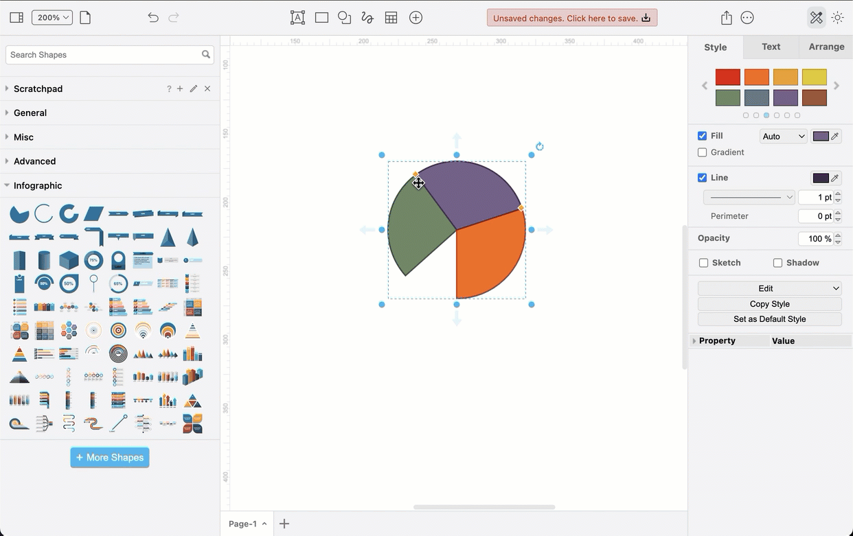
Drag the orange diamond grab handles to change the ‘slice’ of the pie to construct your pie chart from multiple shapes.
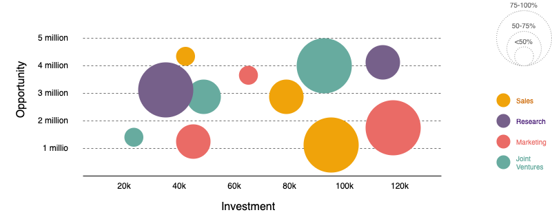
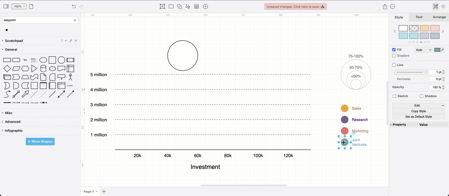
Bubble chart
A bubble chart or circular packing chart uses various sizes of circles to represent the relative sizes of groups. If they are placed on an X Y axis, they ae considered a variation of a scatter plot, where instead of individual data points, they are grouped into bubbles.
Tips for speed
- Use Copy Style and Paste Style in the Style tab of the format panel to quickly colour code circles in your graph from your legend.
- Use Copy Size and Paste Size in the Arrange tab of the format panel to match the size of your bubbles with the chart legend.
Proportional data map: Drag and drop the image file of your map onto the drawing canvas on a background layer. Create a new layer and make sure it is selected, then drop and resize circles to the regions in your map to (roughly) fit your data. It does not need to be exact to convey the information you need it to.
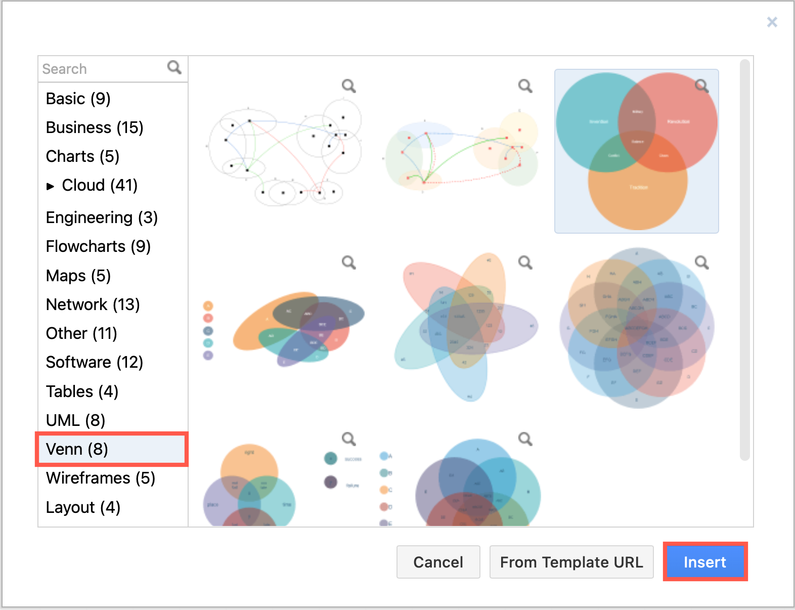
Proportional Venn diagrams: There are a number of attractive Venn diagram templates where the circles and shapes can be resized to show the proportional sizes of related groups.
Related
Refer to this guide to learn the differences between types of diagrams, specifically charts, graphs, diagrams, plots, figures, maps, models and plans.